Creative Spotlight: Expressive Interiors by Marietta Calas

Interior designers are some of my favorite clients to work with.  This is largely because the work they do is all about details. They work hard to get even the smallest nuances just perfect, resulting in a finished project that is not only a statement of their vision and talent, but also reflects their client’s dream.

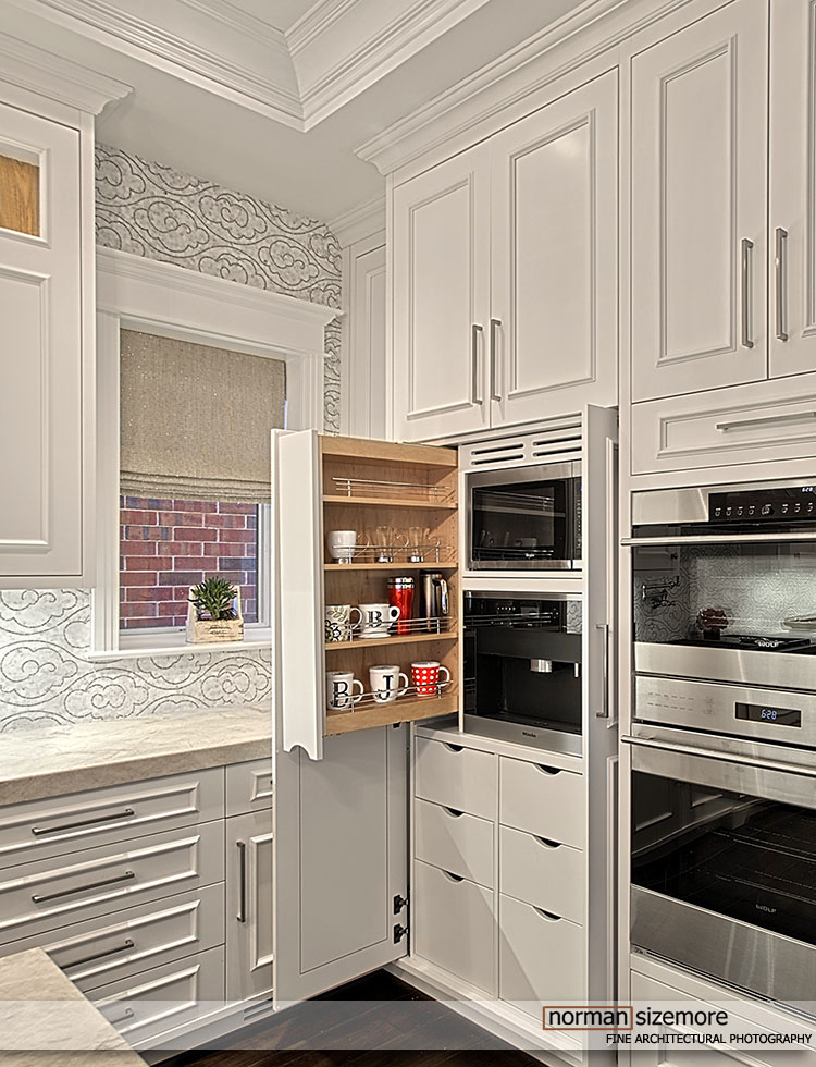
Few, if anyone, do this better than Marietta Calas of Expressive Interiors.  I’ve worked with her on many projects over the years and I’m always impressed with the finished product.  In fact, several images of her work have been featured in my own marketing pieces because of the visual interest she is so adept at creating. 

Everything from paint, wall coverings, carpets, furnishings, fixtures and art are brought together to wow, stun, and thrill at first sight. That was my reaction when I first walked into one of her projects, and it is still my reaction when I see her current work.  I can’t imagine how excited her clients must be when they see the final result!

Her work has been featured in CS Interiors, LUXE, Builders Journal, Chicago/HOME, The Chicago Home & Condo, TRENDS, Build My Kitchen, Architectural Leaders Today, Long Grove Living, Chicago Tribune and The Daily Herald, just to name a few.

Marietta has served for several years on the IFDA Board as well as the Long Grove Architectural Board, and has been consistently recognized with numerous design awards:

Chicago Design Team
Top 10 Designer
2006, 2008, 2010, 2011, 2012, 2014

Best of Houzz
2012, 2013, 2014, 2015, 2016, 2017

The Daily Herald
People’s Choice Award for Interior Design
2009, 2010, 2011, 2012, 2013

International Furnishings and Design Association
Best Interior Design

You can see more of her work at www.expressiveinteriors.net. I have selected a few of my favorites to highlight here.


Creative Spotlight: Benvenuti and Stein

This month, our Creative Spotlight features Benvenuti and Stein, based in Winnetka, Illinois.  They are a multi-faceted firm known for building fine luxury homes, seamless additions, as well as being highly-skilled artisans of woodwork and cabinetry. The quality found in their work is hard to come by and is some of the finest I've ever encountered.

Geno Benvenuti heads up the company and I have often heard him describe the work that they do as a "labor of love".  Among their many specialties are handmade cabinets and furnishings.  Open any drawer, close any door, run your hand across any finish, and you will feel the impeccable quality and solidity of their work. During a photo shoot I will often have to adjust furniture. I once attempted to move one of Geno's  hand-crafted dining tables.  I couldn't.  It wouldn't budge.  I would guess you would need six men if ever you wanted to relocate it. 

This is the craftsmanship that they are well-known for and is seen in even the smallest details. I have photographed the work of many high-end builders and few would be able to stand in the ranks along side Benvenuti and Stein.

Below are just a few samples in a seemingly endless catalog of superb work.


Shot on Film...

We have been taking some time this year to revisit some of our past photo shoots, particularly ones that were shot with film.  Yes ... film.  While most output these days from professional photographers is digital, there are still compelling reasons left for shooting film.

CAMERAS
When digital cameras arrived, film cameras were at their pinnacle. Leica, Minolta, Nikon, Contax, and Canon had been manufacturing film cameras for decades and had thus mastered the process. In addition to the above 35mm favorites, there were the medium format giants as well. Bronica, Hasselblad, Mamiya, Pentax, Fuji, and Rolleiflex gave us some of the finest images of our lifetime.

We all had our favorites, although camera preference was very much a Chevy vs. Ford thing among photographers. I will dig up some of my very well-used film cameras and do a separate post on the ones I preferred. Truthfully, it was hard to go wrong with any of the above-mentioned makes.

LENSES
I am a huge fan of old lenses, those that were designed and built by master craftsmen. No, they are not nearly as accurate as today's glass, but they had character, a certain quality that could make the images look incredible.

FILM
I always get a thrill out of turning on the light table and then placing a transparency on it. The back-lit images look absolutely fabulous. Words can't describe the expression on the faces of those who were raised on digital when they grab a loupe and look at them. 'Shock' would be a good word to begin with. Then the jaws drop and you hear "Wow!" I don't ever remember a single time when that didn't happen.

The reason? Because film is perfect, film is analog, film has a forgiving nature to it, whereas digital tends to accentuate flaws and artifacts.  Film is natural, realistic, beautiful, and in some ways romantic. It has a captivating appeal that will never be equaled by digital. It is also somehow more "legitimate" than digital because when we look at a film strip we know it hasn't been altered. It is truly "as shot".  Film is still the widely recognized benchmark as a true art form in photography. Film also has longevity, the ability to last decades and decades. I have family negatives that are from the 1930s that will scan, print, and display as if they were shot yesterday. All of my personal work is done in film for all of the above reasons.

We had a great time firing up the light table and viewing transparencies. After doing some quick scans, I thought I would share some of them with you. This might become a semi-regular feature here as we found quite a few projects of spaces and people that will soon be integrated into our website.

For now here are just a few:


What To Look For When Hiring an Architectural Photographer


Choosing the right professional to photograph your project is so important, yet it can be overwhelming when you're not sure what to look for.  Should you only consider the financial aspect?  Maybe hire a friend with an 'amazing' camera?  There are many factors to consider when choosing an architectural photographer.  Today I will highlight some points that can help you know what to look for and what to avoid.  As I'm sure you've heard, a picture is worth a thousand words.  So start by viewing photographers' portfolios and keep in mind some of the following points to look for.

· EXCELLENT COMPOSITIONAL SKILLS

Composition in a photograph is so important, and should not be underestimated. A skilled architectural photographer can look at a space and quickly frame up the best shots in their mind's eye. They know instinctively how many views it will take to capture the given space in the most complimentary way.  This not only saves time, but also avoids the pattern of some who simply take many "snapshots" of a room and hope for the best.  Do the photographer's pictures look "intentional" and highlight the space in an appealing yet effective manner, or are you unsure of what you're supposed to be seeing? 


· USE OF HIGH-QUALITY LENSES MADE SPECIFICALLY FOR ARCHITECTURAL PHOTOGRAPHY

Many photographers today like to highlight the type of camera they use.  While the camera is certainly important, in many situations the types of lenses used are even more so. Proper architectural lenses allow the photographer to capture a view with minimal distortion while maintaining complete perspective control over the image. This is critical because it means that all vertical and horizontal lines will be straight.  Pay attention to pictures in photographers' portfolios – walls should be straight, not distorted; in exterior images, buildings should not appear to be "leaning" forward or backward.  Vertical elements such as doorways and pillars should not be curved like bananas. 


· EXPERIENCE IN VARIOUS LIGHTING TECHNIQUES AND CORRECT EXPOSURE

There are many instances when natural light can cause deep, unsightly shadows; these can hide details in furnishings and design.  In most circumstances, determining the best time of day to photograph will prevent these lighting challenges; however, supplemental lighting will sometimes be necessary.  Choose a photographer who is skilled at manipulating light to achieve optimum results, whether it be on-location at the time of the shoot, or in post-production.  What you do NOT want is a photographer whose solution to low light is to over-expose the image.  This results in windows and light fixtures that become virtually unrecognizable, completely blown out and devoid of any detail.  Many times people call these shots "airy"; in reality they are incorrectly exposed and indicative of a photographer with very low standards and technical abilities.  Look for pictures that show the room evenly exposed and windows that you can see through.


· SKILLFUL USE OF POST-PRODUCTION METHODS

More often than not, this is necessary in order to deliver the highest quality product possible.  If the photographer hands you a DVD or flash drive right after the photo shoot, then what they are delivering are essentially ‘snapshots’.   Professional images should almost always go through post-processing, eliminating even slight imperfections and editing the images to the absolute best captures.  Unsightly cords and cables, excessive wall switches, etc, can be distracting in an image.  In many cases, removing these elements can enhance the viewing experience and leave the focus on the beautiful architectural and design elements. 


· TIME MANAGEMENT AND EFFICIENCY

During the image viewing and selection process, you should see only those images that best flatter and highlight the spaces photographed.  The photographer should NOT waste your time by shooting images haphazardly hoping some "turn out", and then making you sift through the mass during a viewing.  I have heard of photographers who will shoot thousands of images during a single architectural shoot (yes – one location), and then upload ALL of the work for the client to view.  This is an unnecessary use of your time, especially once you realize the unprocessed work is the final product.  It also suggests a lack of confidence by the photographer in his ability to compose well and create quality images in a decisive and well thought out manner. In the end, this style of shooting wastes time – both yours and the photographer's – and therefore money.


· FINAL IMAGES THAT WILL ENHANCE YOUR MARKETING EFFORTS

The final image should be captivating, accurate and beautiful.  I say this all the time: quality is more important than quantity. It is far better to use one stunning photograph than dozens of mediocre ones in your marketing materials.  A talented architectural photographer will create beautiful photographs that can be used effectively for years.


There are so many high-quality architectural photographers today and one should keep in mind that a higher price doesn't always mean better photography. Therefore good architectural photography doesn't have to be prohibitively expensive. Finding someone that will meet your marketing needs and work within your budget should not be difficult.  We encourage to keep these points in mind when seeking a professional photographer for your next photo shoot. See what a difference it can make!

What's In a Photograph?

Unlike any other medium today, NOTHING is as revealing as a photograph.  Ever since Joseph Nicephore created the first image in France in the early 1820's photography has been the most accurate method of capturing a moment in time.

Think how important that has been to those that have done so… photographs of people and places…how important it is - or should be - to you the creative professional, interior designer, custom home-builder, or architect. 

Even more important than the photograph is the professional who you choose to create it for you.  The image should be stunningly beautiful, yet accurate and involving to the viewer.  You want it to be looked at, studied and admired. It should be something that represents what it is you have worked so hard to design, build or create.  It should not be a ‘snapshot’.

So often is the case that there are those who put 110% of themselves into every nuance of a particular project… then when it comes time to 'capture' what they have worked so hard to produce they cut corners having it photographed.  'Oh, I know someone with a good camera' is the phrase I hear most often.

One becomes a professional in the creative field from a desire and passion to make a statement, taking time and patience to hone their skill, to excel at their craft.  It is even more so with photography.  A skilled photographer must have an in depth knowledge of lighting, composition, and exposure.   Combining these will create YOUR moment in time, an image that will make a prospective client inquire about YOUR services. 

A photograph should:

  • Highlight your wide range of talents
  • Compliment your portfolio
  • Enhance your marketing
  • Not need an apology


Whatever Happened to Good Photography?


I am always a bit surprised, and highly disappointed, when I thumb through magazines and click through websites and see pages and pages of truly bad architectural photography.

I specialize in high-end interior and exterior architectural photography.  So, I find it quite disturbing when I look at an image supposedly shot by a professional and I can't see through the windows.  Ask yourself, when have you ever been in a room on a sunny day and haven’t been able to see through the window? Exactly.

How about when window treatments are blown out and unrecognizable, and you can't see what the light fixtures should look like?  Have you seen those wide angle views with walls and doors that resemble the shape of a banana?

I can’t stand it when someone  shows me a photo in a magazine and tells me how 'airy' a shot looks. 'Airy'? Really?  The technical term is 'over exposure', and it is caused by someone who doesn't know the first thing about running a camera.  Images like these would have NEVER been accepted for publication by a qualified photo editor not too many years ago.  What has happened to our industry's standards? 

I was commissioned to photograph the interior of a designer's home.  It was a beautiful house in a lovely, rural setting.  It reminded me of being in a lodge or resort.  The designer actually had the home already photographed by another Chicago professional. I didn’t see those images until my client and I were viewing the work that I had shot. 

Below are a few comparisons. You won’t have any trouble telling my work from theirs. I later learned that the first photographer had worked with a crew and brought in studio lights. I came in with a camera bag on my shoulder.  That's it.  All I ever have.  Oh, I was also holding a cup of coffee.


This reminds me of a photo shoot with another designer, who hired me to photograph the interior of a amazing Chicago condo.  When I arrived I learned that space was being photographed by another photographer for publication.  No problem.  I met the photographer, all dressed in black, along with his assistant also all dressed in black.  They had with them tripods, soft boxes, bank lights, light packs, scrims, reflectors, laptops and more cameras than one has a right to own.  I smiled and watched them work; they were very busy setting up lights, moving about, holding reflectors taking light readings. After about six long hours, I think they had created maybe three or four shots. 

In less than four hours I photographed the entire condo sans one bedroom and we ended up with about thirty final images.  They are stunning and clean, beautifully lit, and highlight the design and architecture of the space.  No over-exposed lights, blown out windows, or distorted vertical lines.  


I guess my point in all of this is that our industry as a whole now accepts poor photography overall and I don’t understand why?  There are many outstanding photographers that specialize in this field. 

Photographing interiors and exteriors requires skill, usually honed with years of experience.  It is important that when you select a photographer, that their work will accurately reflects yours. There is no reason to compromise.  One good photograph is worth more than dozens of poor ones. 

I think there is a widespread misconception that quality photography must be prohibitively expensive.  If you are using images with any of the flaws mentioned above, please contact me for a quote.  You might be surprised to learn how affordable high-end photography can be.

Creative Spotlight: The Peter Scherrer Group & Abode Design Studio


One particular assignment that I enjoyed this past year was a team effort of high-end design/build firm The Peter Scherrer Group and interior designer Jana Dahl.  The project had a perfect hideaway setting and produced many challenges, not the least of which was that we had only one day to photograph it.


Notice the fine architectural lines and classic Scandinavian symmetry.  Each level and every room is a conversation piece in its own, offering expansive views and superlative craftsmanship.  The homeowner is a man of many interests, including a love of classic wooden boats.  Notice how the living area opens to offer a full view of his collection…truly breathtaking.  It was like being at a fine nautical museum.

Peter, Leslie and Sam (The Peter Scherrer Group) and Jana (Abode Design Studio) were a joy to work with.  Listening to them tell the story of how this project came to fruition was truly captivating.  This project was one of my favorites of our 2013 workflow.